Call to Action (CTA): What It Is and How to Write One That Converts in 2026

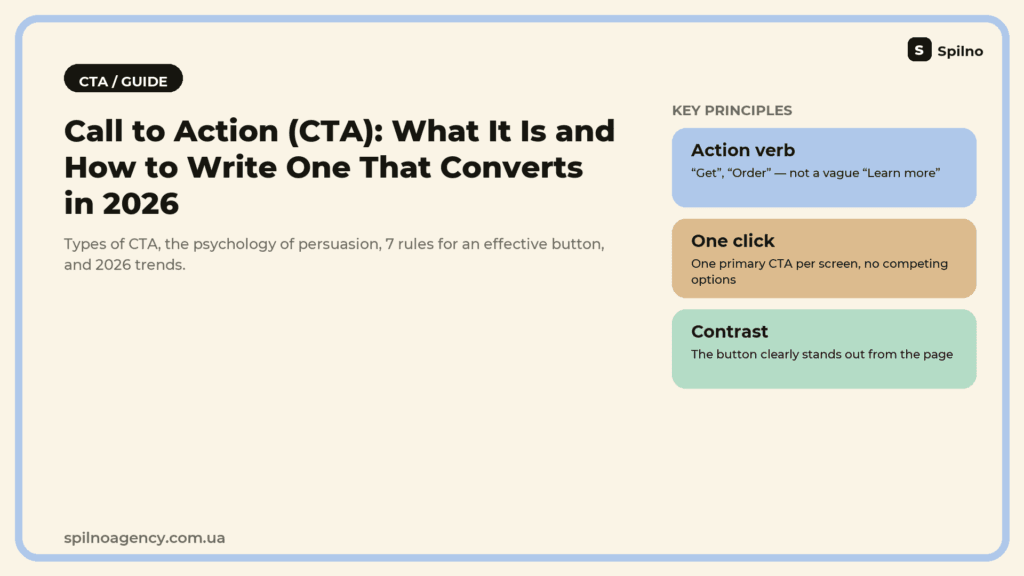
A call to action (CTA) is a piece of text, a button, or a banner that tells a user exactly what to do next: buy, submit an inquiry, subscribe, or download a file. Here’s a look at the main types of CTA, the psychology behind why some calls to action convert and others don’t, how to write a call to action that actually works, and what’s changed about the CTA format in 2026 — from button micro-animations to sentences quoted directly by AI search.
What Is a CTA (Call to Action)
A call to action is exactly what it sounds like: a specific instruction that tells a user what to do next after they’ve read a piece of text, watched an ad, or looked at a product page. Most often a CTA is a button (“Order Now,” “Buy Now,” “Request a Quote”), but it can also be a text link, a banner, a labeled form field, or a closing line in an email.
What sets a CTA apart from ordinary text is intent. A CTA is purpose-built so the user takes one specific action right away, without pausing to wonder “what now?” That’s why a CTA almost always opens with an imperative verb (“Get,” “Try,” “Book”) paired with a result that’s clear before the click even happens.
A CTA isn’t a bolt-on feature — it’s the closing element of practically any marketing message: an ad, a landing page, an email newsletter, a social post. Without a clear CTA, even genuinely engaging copy often just gets closed without any action taken, simply because nobody told the reader what to do next.
Why CTAs Matter for Conversion
A user who lands on a website or sees an ad rarely figures out the next step on their own — even when the product is a good fit. A CTA removes that decision load: instead of “read, then go think about it,” the person sees one obvious next move. This matters most on mobile, where people scroll quickly and won’t hunt for a button that isn’t immediately obvious.
From a marketing-funnel perspective, the CTA is the exact point where interest turns into a measurable action: a click, a submitted form, a purchase. CTA buttons and links are what gets tracked as conversion events in Google Analytics 4 and other analytics platforms, so CTA quality has a direct line to the numbers in your reports — ad CTR, landing page conversion rate, form completion rate.
Changing a CTA’s wording or placement is one of the cheapest ways to lift conversion without spending more on ads. Unlike a site redesign or a new campaign launch, testing a handful of CTA variants can take a day or two and needs no developer resources at all.
Types of CTA
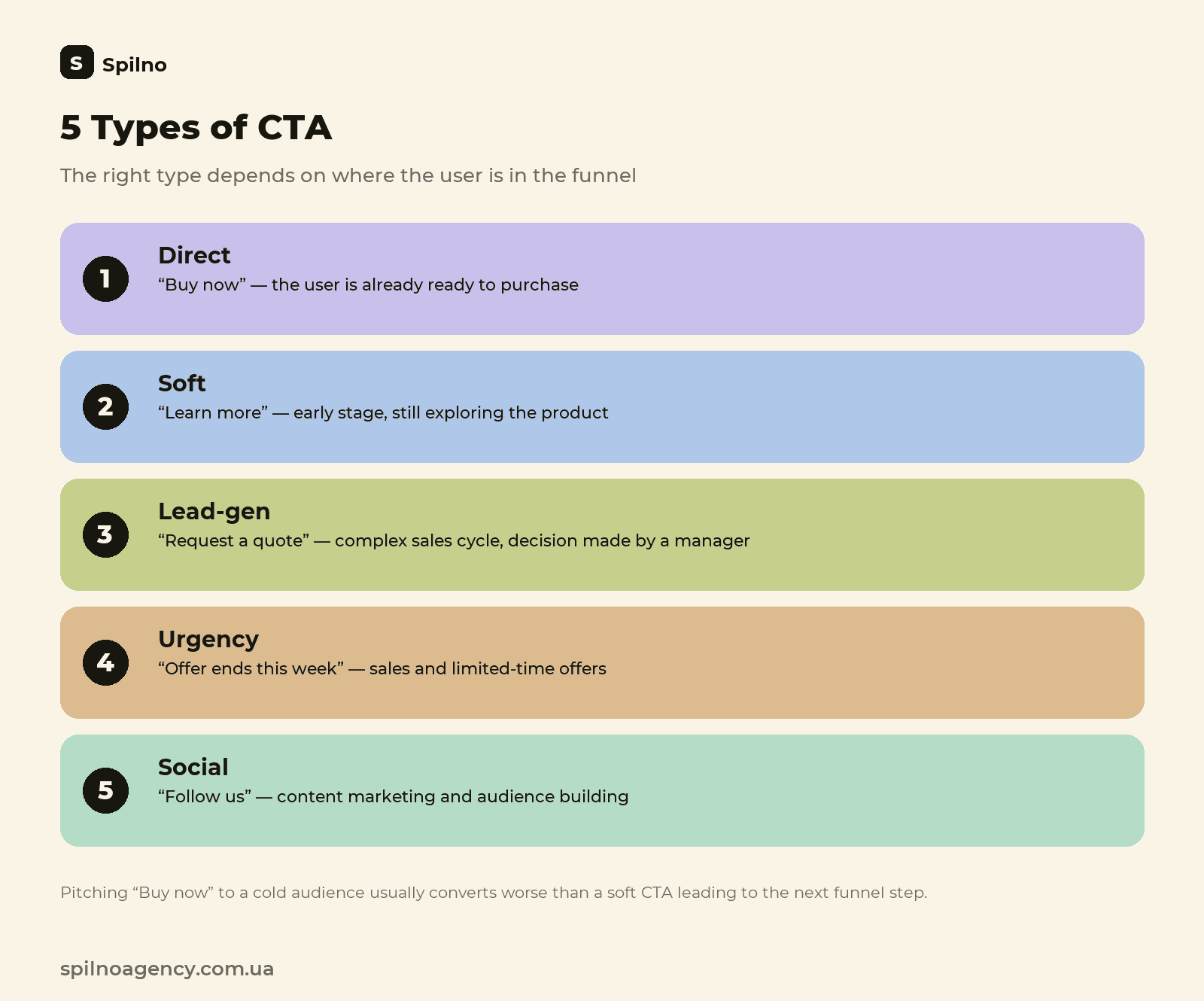
CTAs are typically classified by how big an ask the action is for the user, and by where in the funnel they sit.
| Type | Example wording | When to use |
|---|---|---|
| Direct / transactional | “Buy Now,” “Complete Order” | The user is already ready to buy — product page, cart |
| Soft CTA | “Learn More,” “Browse the Catalog” | Early funnel stage, the user is still exploring the product |
| Lead-gen | “Request a Quote,” “Get a Consultation” | B2B and services with a longer sales cycle where a rep makes the final call |
| Freemium / trial | “Try It Free,” “Start Your Free Trial” | SaaS and subscriptions, where lowering the entry barrier matters |
| Urgency | “Ends This Week,” “Only 3 Spots Left” | Promotions, sales, limited-time offers |
| Social | “Share,” “Follow,” “Join the Community” | Content marketing, social media, audience building |
| Navigational | “Next Step,” “Continue” | Multi-step forms, checkout flows, sign-up funnels |
Which type to use isn’t about which wording sounds better in isolation — it depends on where the user actually is on their journey: pushing “Buy Now” on someone who just discovered the brand usually underperforms a softer “Learn More” that eases them into the next step of the funnel.
The Psychology Behind an Effective CTA
An effective CTA doesn’t rely on one “magic” word — it leans on a handful of well-tested principles of decision-making psychology:
- Clarity beats cleverness. The user needs to understand what happens after the click within half a second, without reading the surrounding copy. “Get a Quote” outperforms a mysterious “Discover the Secret” almost every time.
- Scarcity and urgency. A limited number of spots, a time-boxed offer, or a “today only” discount trigger the fear of missing out — but only when the constraint is real, not manufactured pressure.
- Lowering perceived risk. Phrases like “no commitment,” “cancel anytime,” or “free consultation” ease some of the hesitation before that first click, especially for B2B and higher-priced products.
- Personalization. A first-person CTA (“Get My Quote”) consistently outconverts the impersonal version (“Get a Quote”) in testing, because the user mentally claims the outcome before they’ve even clicked.
- One clear next step. When a screen shows several CTAs with different meanings, the brain spends energy choosing between them instead of acting — this is the paradox of choice at work.
How to Write an Effective CTA: 7 Rules
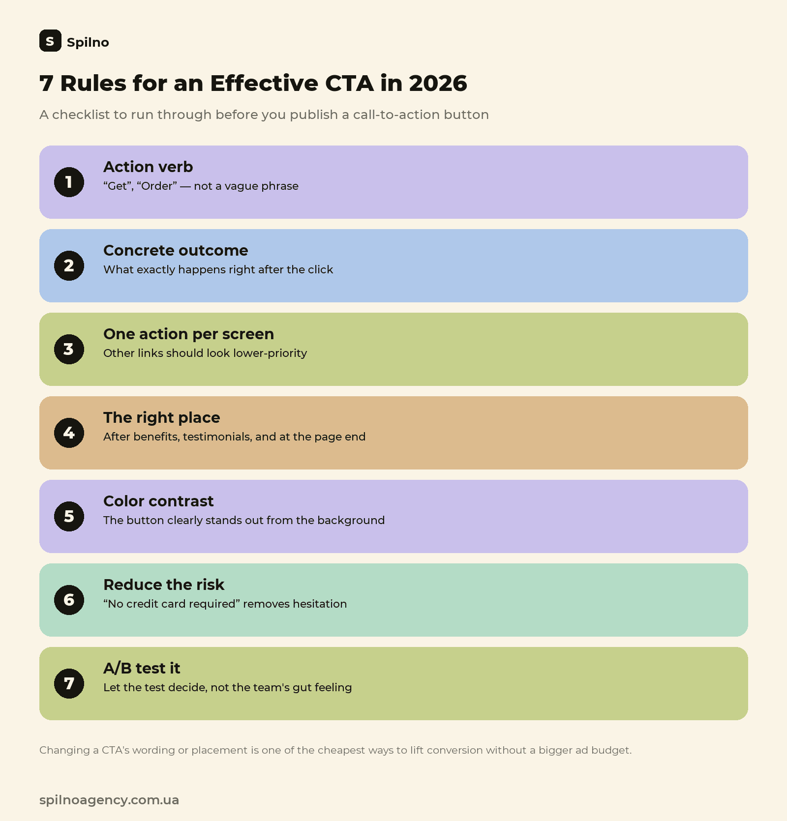
- Start with an imperative verb. “Order,” “Get,” “Book” — not a noun or a vague phrase like “More Information.”
- Show the specific outcome of the action. “Get Your Price Estimate in 2 Minutes” builds far more confidence than a bare “Calculate.”
- Keep one message to one action. One primary CTA per screen — any other links (like “Learn About Our Company”) should visually read as lower priority.
- Place the CTA where the user is already ready to act. Right after the benefits section, after testimonials, or at the end of the copy — not only once at the very top of the page.
- Aim for contrast, not a specific color. A button needs to stand out clearly against the rest of the page — the exact shade is secondary to the contrast itself.
- Lower the perceived risk right next to the button. A short line like “no card required” or “we reply within 15 minutes” underneath the button removes some of the hesitation.
- Test on real traffic, not intuition. Even experienced marketers regularly guess wrong about which wording performs better — let an A/B test decide, not a team opinion.
CTA by Channel
The same call to action performs differently depending on the channel, so both wording and placement need to be adapted to the context in which the user encounters it.
Website & Landing Pages
On a service page or landing page, the primary CTA is worth repeating several times as the page scrolls — in the first screen, after the benefits block, and again at the end — so the user can convert at whichever point they’ve made up their mind, without scrolling back up. Lead-capture forms on these pages should feed straight into a CRM: for more on setting that process up, see the guide on lead generation and its types.
Email Newsletters
In email, a single CTA button performs more reliably than several links scattered through the copy — too many options lowers the click-through rate on each one. Place the button above the fold (the part of the email visible without scrolling on mobile), since that’s where most people actually engage with an email.
Social Media & Reels
In short-form video like Reels or TikTok, the CTA is most often spoken out loud or shown as on-screen text in the first and last seconds of the clip, rather than tucked into a caption that a much smaller share of viewers ever reads. For more on short-video formats and where the CTA belongs in them, see the guide on Instagram Reels.
Paid Ads (Google Ads, Meta Ads)
In a paid ad, the CTA has to match the expectation the ad itself set: if the copy promised a discount and the landing page leads to a generic catalog with no mention of it, the user notices the mismatch and leaves — which directly drags down the ad’s quality score and drives up cost per click.
CTA Examples by Business Category
| Category | Example CTA | Why it works |
|---|---|---|
| E-commerce | “Add to Cart — Only 4 Left” | Direct action plus real scarcity |
| B2B services | “Get a Quote Within 24 Hours” | Specific outcome and a concrete timeframe |
| SaaS / subscriptions | “Try 14 Days Free, No Card Needed” | Lower barrier to entry, payment risk removed |
| Education | “Reserve Your Spot — Cohort Starts the 15th” | A concrete date creates a real deadline |
| Local business (salons, clinics) | “Book Your Appointment in 1 Minute” | Emphasizes speed and simplicity |
CTA Trends in 2026
- CTAs built for generative search (GEO). When a user sees the answer inside an AI overview or a chatbot instead of clicking through to a site, the call to action needs to be phrased as a self-contained sentence right in the text (“Book a free audit at spilnoagency.com.ua”) that an AI system can quote alongside its own answer.
- Micro-animation and button state. A subtle hover or click animation (a color shift, a small “bounce”) signals that an element is interactive — especially useful on visually busy pages where a button could otherwise be mistaken for decoration.
- Behavioral personalization. CTA copy shifts dynamically based on whether the visitor is returning, where they came from, and what they’ve already viewed — “Resume Checkout” for someone with an abandoned cart, instead of a generic “Buy.”
- Voice and conversational CTAs. In chatbots and voice assistants, the call to action isn’t a button at all — it’s a line like “Want me to book you a consultation right now?” which needs a different approach to wording than a button label does.
- In-app micro-CTAs. Instead of one big ask at the end, short prompts appear at each step of the user journey (onboarding, checkout), spreading out the cognitive load instead of front-loading it.
Common CTA Mistakes
- Vague wording. “Learn More” or “Click Here” don’t explain what happens after the click — users hesitate, and often just close the page instead.
- Multiple competing CTAs on one screen. “Buy,” “Subscribe to Our Newsletter,” and “Download the Catalog” side by side force a choice instead of prompting action.
- A CTA that doesn’t match the funnel stage. “Buy Now” aimed at a cold audience seeing the brand for the first time converts worse than a softer intermediate step.
- A button that disappears into the design. Weak contrast against the background or a size that’s too small, and users simply never notice the element that was supposed to convert.
- No CTA below the first screen. Plenty of users only decide after scrolling down to testimonials or a detailed description — if there’s no repeated CTA there, that conversion is lost.
- Wording picked by gut feel instead of tested. A copywriter or marketer chooses a CTA variant based on personal taste instead of checking a few options against real data.
How to A/B Test a CTA
The cheapest, fastest way to lift conversion is to test 2-3 CTA variants on real traffic instead of trusting a team’s collective gut feel. The principle is simple: change one variable at a time — only the wording, only the color, or only the placement — otherwise there’s no way to know what actually moved the result.
- What to test: the wording itself, button color and size, placement on the page, and whether a risk-reducing line sits next to the button.
- Minimum traffic volume: a test only makes sense with enough views per variant — on low traffic, differences in conversion are usually noise rather than a statistically meaningful signal.
- Where to measure results: track CTA clicks and the conversions that follow as separate events in Google Analytics 4, so you can see not just the click itself but what happened next — a completed form, a purchase, a sign-up.
Frequently Asked Questions About CTAs
What does CTA stand for?
CTA stands for Call to Action. It’s a piece of text or a button that tells the user exactly what to do next: buy, submit an inquiry, subscribe, or download a file.
How is a CTA different from an ordinary call-to-action phrase in text?
A CTA is a deliberately designed element with a clear metric (a click, a submission, a purchase), visually set apart and placed at a predictable point — unlike a stray phrase in a paragraph with no distinct design of its own.
How many CTAs should one page have?
Ideally one primary action, repeated a few times as the page scrolls. Several unrelated CTAs at once lower conversion through the choice effect.
What’s the best verb for a CTA?
There’s no universal verb — it depends on the audience and the product. Specific action verbs (“Order,” “Get”) usually beat vague ones (“Learn More”), and A/B testing is the reliable way to find out what works.
Does CTA button color affect conversion?
Contrast against the background matters, not a specific shade. Pick a color that fits the brand guidelines and check contrast, rather than copying a “high-converting color” from someone else’s case study.
How is AI search changing CTA requirements in 2026?
The call to action increasingly needs to live in the text itself, as a self-contained phrase an AI system can quote alongside its own answer, not only as a design element on a button.

Read also
Google Data Studio (Looker Studio): What It Is and What It Can Do
Looker Studio (formerly Google Data Studio) is Google's free BI tool. We break down connectors, dashboards, and use…
Instagram: What Are Reels and How to Use Them
Reels are short vertical videos on Instagram that the algorithm shows even to non-followers. Technical specs, how Reels…
UGC Content: What It Is and How to Use It in 2026
UGC content is reviews, unboxings, and videos made by real people. Types of UGC, what a UGC creator…